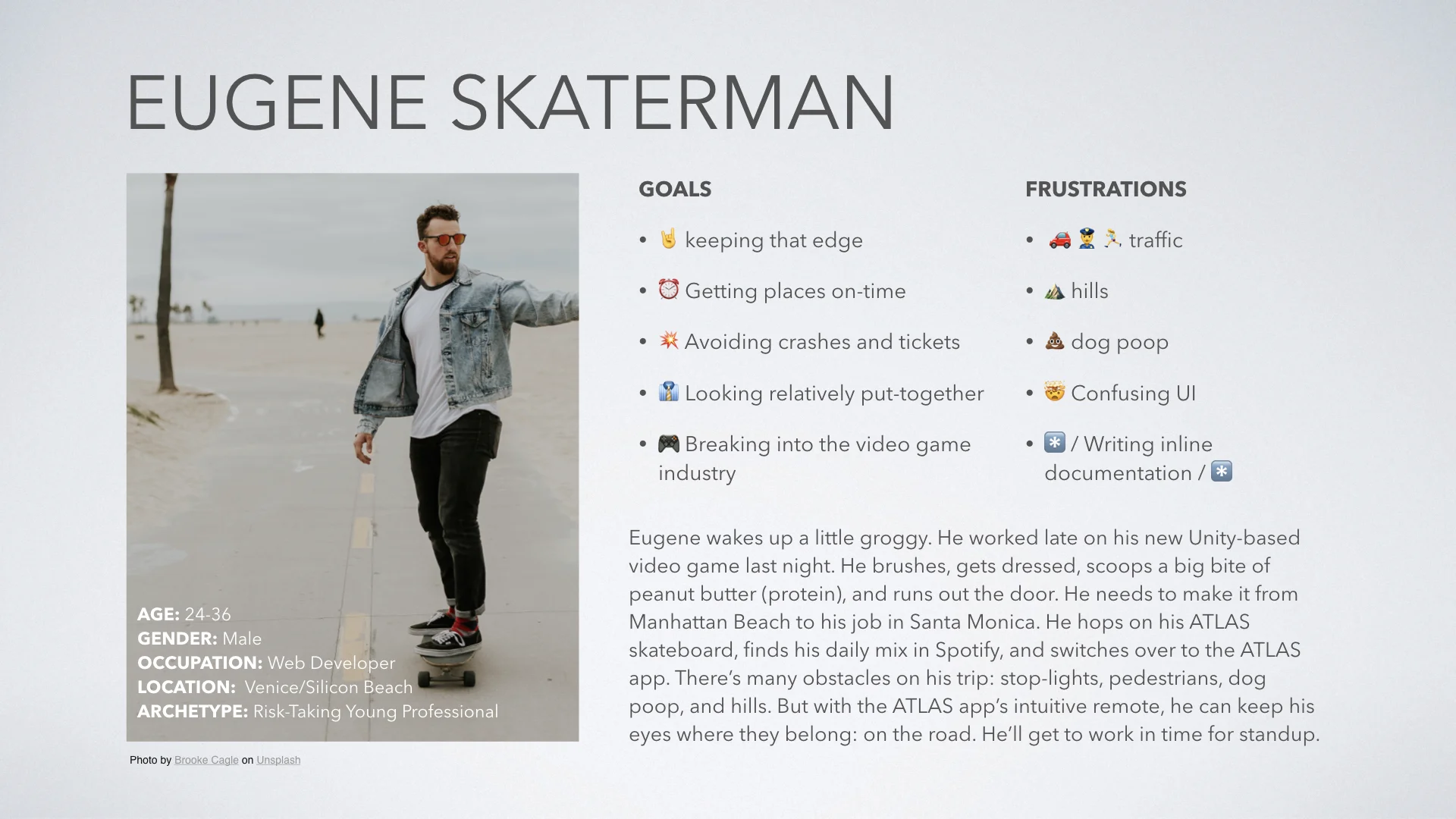
Research
I spent a few days wandering the busy streets of San Francisco, watching people commuting by bike, scooter, electric skateboards, and walking. I went online to look at competitors to see the way their skateboards were controlled. Many competitors provided a physical remote to operate the board. These remotes were designed to provide haptic feedback, but a screen/mobile device was a little more limited in its capabilities. It was important to get the haptic cues right, so the driver could make split-second reactions to the busy streets around them.
Define
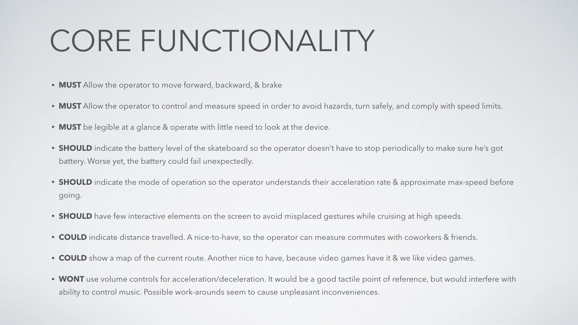
Before I design any interface, I find it essential to simply define the functionality necessary to create a convenient user experience. Having a list of priorities and functions allows me to explore different visual directions and creatively solve problems without losing sight of the essentials. I’m also extremely forgetful, so it helps to have a written record to reference while defending my design decisions.
UI Design
With research and requirements to direct me, I was on to design the user interface. Given the requirement that the user wouldn’t be looking at the screen much during operation, there is only one interaction on the screen, the throttle. The image above shows the three states of idle, to in motion while the user is holding down and pulling forward with their thumb, and breaking while the user is pulling backward with their thumb. The arrows on the interface are inspired by street signs and the dark interface is inspired by a car’s dashboard.


